
Reducing Form and Field Friction in Checkout and Sign-Up
On this page
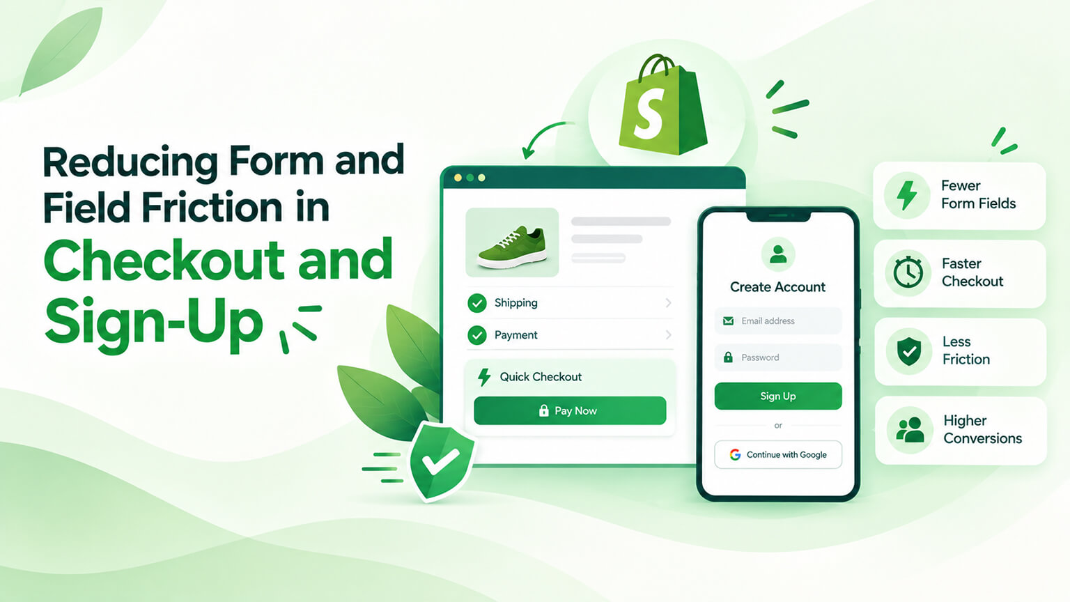
Forms and fields (the inputs customers fill in — during checkout, sign-up, account creation, and elsewhere) create friction: every field is effort for the customer, and too many fields, confusing fields, or difficult forms create friction that causes abandonment and lost conversions (customers give up on tedious or frustrating forms). This is especially costly in checkout (where form friction causes abandonment and lost sales, as the checkout-abandonment discussions cover) and sign-up (where friction stops account creation). Reducing form and field friction — minimising and simplifying fields, making forms easy — reduces abandonment and improves conversion (easier forms get completed more). So reducing form friction is a valuable conversion optimisation. This piece covers reducing form and field friction in checkout and sign-up: why form friction matters, how to reduce it, best practices, and considerations. (This connects to the checkout-abandonment and CRO discussions; this focuses on form/field friction.)
This piece covers why form friction matters (its impact), how to reduce form and field friction, best practices, and key considerations. Because form friction costs conversions and reducing it improves conversion, and understanding how helps you optimise forms. Let me walk through it.
Why form friction matters (its impact)
Let’s cover why form and field friction matters. Every field is effort — every field is effort for the customer (thinking, typing, deciding), and effort creates friction (customers don’t want to work hard), so more fields mean more friction — effort (the basic point). Friction causes abandonment — form friction causes abandonment (customers give up on long, tedious, or difficult forms — especially at checkout, where abandonment means lost sales, and at sign-up, where it means no account), directly costing conversions — abandonment (the cost). Checkout is critical — form friction in checkout is especially costly (checkout is where sales complete, and friction there causes cart/checkout abandonment and lost revenue, as the abandonment discussions cover), so checkout form friction directly loses sales — checkout (critical). Sign-up friction stops accounts — form friction in sign-up stops account creation (customers abandon tedious sign-ups), losing accounts/customers (and the benefits of accounts) — sign-up (friction stops it). Friction frustrates — form friction frustrates customers (a poor experience), hurting the experience and the brand impression (versus smooth forms) — frustration (experience cost). Small friction adds up — small friction per field adds up (each field, each bit of confusion, each difficulty compounds into significant friction across a form), so reducing friction across fields matters — compounding (small things add up). Mobile amplifies it — form friction is worse on mobile (typing and forms are harder on mobile, where much traffic is, as the mobile discussions cover), so friction especially hurts mobile conversion — mobile (amplified). And it’s often fixable — form friction is often fixable (reducing fields, simplifying forms — a concrete optimisation), so it’s an addressable conversion opportunity — fixable (an opportunity). So form friction matters because every field is effort (creating friction), friction causes abandonment (lost conversions — especially costly in checkout, where sales complete, and sign-up, where accounts are created), it frustrates customers (an experience cost), small friction adds up (compounding), mobile amplifies it, and it’s often fixable (an addressable opportunity). The key: form friction directly costs conversions (especially in checkout), so reducing it improves conversion. The next section covers how to reduce it. So form friction matters because it causes abandonment and lost conversions (especially in checkout and sign-up), frustrates customers, and compounds — but it’s fixable.
How to reduce form and field friction
Reducing form and field friction means minimising and simplifying. Minimise the number of fields — minimise fields (only ask for what you truly need — every unnecessary field is needless friction), the biggest lever (fewer fields = less friction), so cut unnecessary fields — minimise fields (the top lever). Only ask what’s necessary — only ask for necessary information (question every field — do you really need it now? can you get it later or not at all?), removing non-essential fields — necessity (question every field). Use smart defaults and autofill — use smart defaults and support autofill (pre-filling where possible, supporting browser/address autofill, so customers type less), reducing effort — defaults/autofill (reduce typing). Use address autocomplete — use address autocomplete (letting customers select an address rather than typing it all), reducing address-field friction (a common friction point) — address autocomplete. Enable guest checkout — enable guest checkout (not forcing account creation to buy, as the abandonment discussions cover), removing sign-up friction from checkout (a major friction reducer) — guest checkout (key for checkout). Offer accelerated checkout — offer accelerated checkouts (Shop Pay, express options that fill/skip fields via stored info, as the checkout discussions cover), letting customers skip form-filling — accelerated checkout (skip fields). Simplify and clarify fields — simplify and clarify fields (clear labels, logical fields, sensible input types, clear formatting), so fields are easy to understand and complete (versus confusing) — clarity (simplify fields). Good input design — use good input design (appropriate field types — e.g., numeric keyboards for numbers on mobile; clear formatting; helpful hints), easing input (especially on mobile) — input design. Show clear validation — show clear, helpful validation (clear error messages, inline validation, so customers fix errors easily versus struggling), reducing error friction — validation (clear/helpful). Logical flow and layout — use a logical form flow and clean layout (sensible order, clear structure, not overwhelming), easing completion — flow/layout. Reduce required fields — make fields optional where possible (fewer required fields = less forced effort), reducing required friction — optional fields (where possible). And optimise for mobile — optimise forms for mobile (easy mobile input, appropriate keyboards, minimal typing, as the mobile discussions cover), since mobile form friction is worse — mobile (optimise). So reduce form and field friction by minimising the number of fields (the top lever — only what’s necessary), using smart defaults and autofill, using address autocomplete, enabling guest checkout (key for checkout), offering accelerated checkout (skip fields), simplifying and clarifying fields, using good input design, showing clear validation, using logical flow and layout, making fields optional where possible, and optimising for mobile. The keys are minimising fields, autofill/defaults, guest and accelerated checkout, clear/simple fields, and mobile optimisation. So reduce form friction by minimising fields, easing input (autofill, defaults, accelerated checkout), clarifying fields, and optimising for mobile. The next section covers best practices. So reduce form friction by minimising fields, easing input, clarifying fields and validation, and optimising for mobile — with guest and accelerated checkout key for checkout.
Best practices for forms and fields
Here are best practices for low-friction forms and fields. Ask for the minimum — the top practice: ask for the minimum information necessary (fewer fields = less friction = more completion), so ruthlessly minimise fields — minimum fields (the top practice). Enable guest checkout — enable guest checkout (don’t force account creation, as the abandonment discussions cover), a checkout best practice — guest checkout (best practice). Offer accelerated checkout — offer Shop Pay and express checkouts (skipping form-filling for returning/express customers), a checkout best practice — accelerated checkout. Support autofill/autocomplete — support browser autofill and address autocomplete (letting customers avoid typing), a friction reducer — autofill/autocomplete. Clear labels and instructions — use clear labels and instructions (customers know what each field wants), reducing confusion — clarity (labels). Inline, helpful validation — use inline, helpful validation (clear errors, real-time feedback, easy fixes), easing error handling — validation. Logical order and grouping — order and group fields logically (a sensible flow, grouped sensibly), easing completion — order/grouping. Minimise typing — minimise typing (defaults, autofill, selection over typing, appropriate inputs), reducing effort (especially mobile) — minimise typing. Mobile-optimised forms — optimise forms for mobile (easy input, right keyboards, minimal fields), since mobile is friction-prone — mobile. Show progress (in checkout) — show progress in multi-step checkout (so customers know where they are and that it’s short), reducing uncertainty — progress. Don’t ask twice — don’t ask for the same info twice (avoid redundant fields), reducing needless effort — no redundancy. And test and measure — test and measure forms (form completion, abandonment; A/B test form changes, as the testing discussions cover), optimising based on data — test/measure. So best practices for forms and fields: ask for the minimum (the top practice), enable guest checkout, offer accelerated checkout, support autofill/autocomplete, use clear labels/instructions, use inline helpful validation, order/group fields logically, minimise typing, optimise for mobile, show progress in checkout, don’t ask twice, and test/measure. The overarching practice: minimise and simplify — ask for as little as possible, as easily as possible. The next section covers considerations. So best practices are minimising fields, guest/accelerated checkout, autofill, clear labels/validation, minimal typing, mobile optimisation, and testing — minimise and simplify.
Key considerations
A few considerations for reducing form friction. Balance data needs vs. friction — balance the data you want (for accounts, marketing, personalisation) against friction (each field asked adds friction), so collect what you truly need and defer or skip the rest (don’t over-collect at the cost of conversion) — balance (data vs. friction — a key trade-off). Checkout is highest-priority — checkout forms are the highest priority (form friction there directly loses sales), so prioritise reducing checkout friction (guest checkout, accelerated, minimal fields) — checkout (prioritise). Get data later if possible — get non-essential data later if possible (post-purchase, over time, via optional profile completion — rather than upfront at the cost of conversion), deferring friction — defer data collection. Guest checkout vs. accounts — balance guest checkout (reduces friction) with encouraging accounts (which have benefits) — e.g., offer guest checkout but invite account creation post-purchase (as the abandonment discussions cover) — guest vs. accounts (balance). Mobile is critical — mobile form friction is critical (worse on mobile, much traffic there), so prioritise mobile forms — mobile (critical). Don’t sacrifice necessary data — don’t remove necessary fields (some data is required — shipping address, etc.), so minimise without breaking function (reduce friction, but keep what’s needed) — necessary data (keep it). Test changes — test form changes (measure the impact on completion/conversion — do fewer fields help? by how much?), so you optimise based on data — testing (measure). Shopify’s checkout helps — Shopify’s checkout is already optimised (and offers guest checkout, Shop Pay, autofill — reducing friction, as the checkout discussions cover), so leverage Shopify’s checkout optimisations — Shopify (leverage). And it’s a high-value optimisation — reducing form friction is often high-value (forms are conversion chokepoints, especially checkout — small reductions can meaningfully lift conversion), so it’s worth prioritising — high-value (prioritise it). So key considerations: balance data needs vs. friction (a key trade-off — don’t over-collect), checkout is highest-priority (prioritise it), get non-essential data later if possible (defer friction), balance guest checkout vs. encouraging accounts, mobile is critical, don’t sacrifice necessary data, test changes (measure impact), leverage Shopify’s checkout optimisations, and it’s a high-value optimisation. The key considerations: balancing data vs. friction, prioritising checkout, and testing. So consider balancing data vs. friction, prioritising checkout, deferring non-essential data, and testing — reducing friction as a high-value optimisation. So consider the data-vs-friction balance, prioritise checkout, defer non-essential data, optimise for mobile, and test — treating form-friction reduction as a high-value optimisation.
The bottom line
Forms and fields — the inputs customers fill in during checkout, sign-up, account creation, and elsewhere — create friction, because every field is effort for the customer, and too many fields, confusing fields, or difficult forms cause abandonment and lost conversions. This is especially costly in checkout (where form friction causes cart and checkout abandonment and lost sales) and sign-up (where friction stops account creation), it frustrates customers and hurts the experience, small friction per field compounds across a form, and mobile amplifies it all (typing and forms are harder on mobile, where much traffic is) — but it’s often fixable, making form-friction reduction a valuable and addressable conversion optimisation. To reduce form and field friction: minimise the number of fields (the top lever — only ask for what you truly need, questioning every field), use smart defaults and support autofill, use address autocomplete (a common friction point), enable guest checkout (key for checkout — don’t force account creation to buy), offer accelerated checkouts like Shop Pay and express options (letting customers skip form-filling), simplify and clarify fields (clear labels, logical fields, sensible input types), use good input design (appropriate field types and keyboards, especially on mobile), show clear and helpful inline validation, use a logical flow and clean layout, make fields optional where possible, and optimise forms for mobile. The best practices come down to minimise and simplify — ask for as little as possible, as easily as possible — alongside guest and accelerated checkout, autofill and autocomplete, clear labels and validation, logical ordering, minimal typing, progress indicators in multi-step checkout, no redundant fields, and testing and measuring form changes. Keep the key considerations in mind: balance the data you want against the friction each field adds (don’t over-collect at the cost of conversion — a key trade-off), prioritise checkout forms (where friction directly loses sales), get non-essential data later if possible (post-purchase or via optional profile completion rather than upfront), balance guest checkout against encouraging accounts (offer guest checkout but invite account creation post-purchase), treat mobile as critical, don’t remove necessary fields (minimise without breaking function), test form changes to measure their impact on completion and conversion, leverage Shopify’s already-optimised checkout (with guest checkout, Shop Pay, and autofill), and recognise that reducing form friction is often high-value (forms are conversion chokepoints, especially checkout, where small reductions can meaningfully lift conversion). So reduce the form and field friction in your checkout and sign-up — minimise and simplify fields, ease input with autofill and accelerated checkout, enable guest checkout, clarify fields and validation, and optimise for mobile — to cut abandonment and lift conversion. Done well, low-friction forms get completed and convert; done poorly (long, confusing, tedious forms), they cost you sales and accounts at the very moment customers are ready to act — so make your forms as short and easy as they can be.
Frequently asked questions
Why do forms and fields hurt conversion?
Because every field is effort, and effort creates friction that makes customers give up. Each field requires the customer to think, decide, and type, and the more fields (and the more confusing or difficult they are) the more friction the form creates — and friction causes abandonment. This is especially costly in two places: checkout, where form friction causes cart and checkout abandonment and directly loses sales at the moment of purchase, and sign-up, where friction stops customers from creating accounts. Form friction also frustrates customers and leaves a poor impression, and small amounts of friction per field compound across a whole form into a significant barrier. Mobile makes it worse, since typing and filling forms are harder on small screens, where a lot of traffic now is. The upside is that form friction is usually fixable — by minimising and simplifying fields — so it’s an addressable conversion opportunity rather than a fixed cost, and reducing it tends to directly improve completion and conversion, especially at checkout.
How do I reduce form friction in checkout and sign-up?
Minimise and simplify. The biggest lever is reducing the number of fields — only ask for what you truly need, and question every field (do you really need this now, or can you get it later or not at all?). Then make the remaining fields as easy as possible: support browser autofill and address autocomplete so customers type less, use smart defaults, and use good input design (appropriate field types and mobile keyboards, clear formatting). For checkout specifically, enable guest checkout so you’re not forcing account creation to buy (a major friction reducer), and offer accelerated checkouts like Shop Pay and express options that let customers skip form-filling with stored information. Use clear labels and instructions so customers understand each field, show helpful inline validation so errors are easy to fix, order and group fields logically, make fields optional where you can, and optimise the whole form for mobile. Finally, test and measure your changes — track completion and abandonment and A/B test form changes — so you know reducing fields is actually helping and by how much.
Should I require account creation or allow guest checkout?
Allow guest checkout — forcing account creation to buy is a major source of checkout friction and abandonment. Requiring customers to create an account before they can purchase adds effort and a barrier right at the moment they’re ready to pay, and many will simply give up. The better approach is to offer guest checkout so customers can buy with minimal friction, and then invite account creation after the purchase (for example, offering to save their details into an account post-purchase, which is much lower-friction because they’ve already entered the information). That way you get the conversion first and still capture accounts where customers want them, rather than losing the sale by demanding an account upfront. Accounts do have real benefits (easier reordering, saved details, order history, marketing relationships), so it’s worth encouraging them — just not at the cost of the initial conversion. Balance the two: guest checkout to reduce friction and win the sale, plus a low-friction, post-purchase invitation to create an account.
Which forms should I prioritize, and how much data should I collect?
Prioritise checkout forms above all, and collect as little data as you can get away with. Checkout is the highest-priority form because friction there directly loses sales at the point of purchase, so reducing checkout friction (guest checkout, accelerated checkout, minimal fields, autofill) is typically the highest-value form optimisation you can make. On how much data to collect, balance what you want against the friction each field adds: every field you ask for — for accounts, marketing, or personalisation — adds friction and risks conversion, so collect only what you need to complete the transaction, and defer non-essential data to later (post-purchase, over time, or via optional profile completion) rather than demanding it upfront. Don’t remove necessary fields (you still need a shipping address, for example) — the goal is to minimise without breaking function. And because forms, especially checkout, are conversion chokepoints where small reductions can meaningfully lift conversion, treat form-friction reduction as a high-value optimisation: test your changes, measure the impact on completion, and lean on Shopify’s already-optimised checkout, which provides guest checkout, Shop Pay, and autofill out of the box.