
The Anatomy of a Shopify Product Page That Actually Converts
On this page
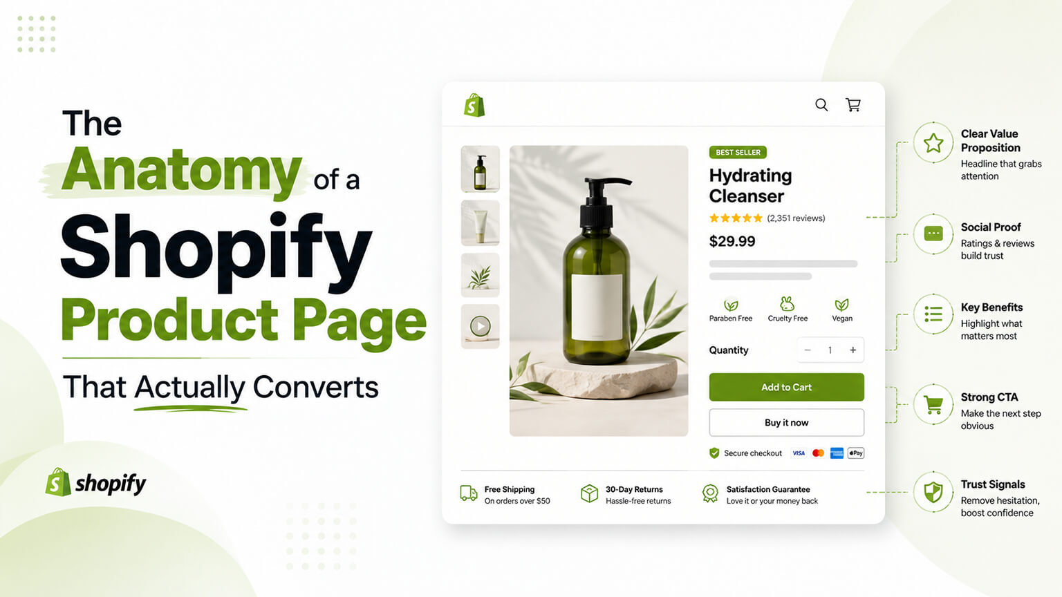
Your product page is where the sale is won or lost. Traffic, ads, email — all of it funnels here, and if the page doesn’t do its job, every dollar spent getting people to it is wasted. Yet product pages are where I see the most preventable mistakes: critical information buried, weak or missing social proof, a buy box that fights the shopper, and a wall of manufacturer copy nobody reads.
Let’s walk through the page the way a shopper experiences it and look at what actually moves conversion at each step. This isn’t a list of “best practices” to apply blindly — it’s a way of thinking about what the shopper needs at each moment and making sure the page provides it.
Start with the job the page has to do
Before the anatomy, the mindset. A shopper arrives with questions, spoken and unspoken: Is this the right thing for me? Can I trust it (and you)? What exactly will I get? Is the price fair? What if it’s wrong? The product page’s entire job is to answer those questions faster and more convincingly than the doubt that makes people close the tab. Every element either helps answer a question or it’s clutter. Judge each part of your page by that standard and most decisions get easier.
The image gallery: your most important salesperson
Online, people can’t touch the product, so images carry the weight that handling would carry in a store. This is the most under-invested part of most product pages, and it’s the one shoppers engage with most.
Show the product from multiple angles, in use, and at a scale that conveys size — a bag photographed alone tells you nothing about whether it fits a laptop; a bag on a person’s shoulder does. Include detail shots of the parts that matter (the stitching, the texture, the closure). For many categories, lifestyle images showing the product in context outperform sterile white-background shots because they help the shopper picture it in their own life. Video, where you can manage it, is even better at this.
The technical catch: image-rich galleries are exactly where page speed dies. The answer isn’t fewer images, it’s properly optimized ones — modern formats, correct sizes, lazy loading for images below the initial view, and a priority load on the first image so the page paints fast. You want the richness without the sluggishness, and that’s an engineering detail worth getting right because it sits at the exact spot where shoppers decide.
The buy box: clarity beats cleverness
The buy box — title, price, options, add-to-cart — is where intent turns into action, and it should be effortless. This is not the place for creativity that adds friction.
Variant selection trips up more stores than anything. If a shopper has to guess which combination is in stock, or can select an unavailable option only to be told no after they’ve committed mentally, you lose them. Make options obvious, show availability clearly, and don’t make people work to understand what they’re buying. For products with size, fit, or specification choices, put help right where the choice is made — a size guide link next to the size selector, not buried in a tab.
The add-to-cart button should be unmissable and unambiguous. One clear primary action. Resist surrounding it with competing buttons that scatter attention. And the price should be clear and honest — surprise costs appearing later are a top reason carts get abandoned, so if there are conditions (shipping thresholds, subscription discounts), surface them here rather than springing them at checkout.
Social proof, positioned where doubt strikes
Reviews are the trust engine of the product page, but their placement matters as much as their presence. The review star rating should be visible near the top, by the title, where it reassures immediately — a strong rating up front gives the shopper permission to keep reading. The detailed reviews themselves belong further down, where shoppers go when they’re seriously considering and want to hear from people like them.
Quality of social proof beats quantity of claims. A handful of genuine, specific reviews — especially with photos from real customers — outperforms a vague “thousands of happy customers” banner. Photo and video reviews are particularly powerful because they show the real product as real buyers received it, which counters the fear that the polished brand images are hiding something. If you sell anything where fit or results vary, reviews that mention those specifics (“runs small, sized up,” “took three weeks to see results”) build more trust than uniformly glowing ones, precisely because they read as honest.
The details: answer questions before they become objections
Below the buy box is where you handle everything a serious shopper needs to know: full description, specifications, materials, dimensions, what’s included, care instructions, shipping and returns. The mistake here is two-sided. Some stores dump a wall of manufacturer copy nobody reads; others strip the page so bare that real questions go unanswered and the shopper leaves to find out elsewhere (and often doesn’t come back).
Write this section for your actual buyer’s questions. What do people email you to ask before purchasing? Those answers belong on the page. Structure it so shoppers can scan to what they care about — clear subheadings, short chunks, tables for specs — rather than reading top to bottom. And write the description in your own voice about what the product does for the customer, not the generic copy that’s identical across every retailer selling the same item. That unique copy serves conversion and SEO at once.
Shipping and returns deserve special mention because they’re silent dealbreakers. Uncertainty about delivery time or return policy kills sales quietly — the shopper doesn’t complain, they just leave. State your shipping timeframe and return policy clearly and accessibly. A generous, clearly stated return policy often increases sales by more than the cost of the extra returns, because it removes the risk that stops people committing.
Trust signals throughout
Beyond reviews, small trust cues accumulate into confidence, especially for first-time buyers who don’t yet know you. Secure-checkout indicators, recognizable payment options, guarantees or warranties, genuine certifications relevant to your category, and clear, findable contact information all signal that you’re a real, reliable business rather than a fly-by-night operation. None is dramatic on its own; together they tip nervous shoppers over the line.
Urgency and scarcity: handle with care
Low-stock indicators and limited-time offers can nudge a hesitating shopper to decide, and used honestly they’re legitimate. Used dishonestly — fake countdown timers, permanent “only 2 left” messages — they’re a short-term trick that erodes trust the moment a shopper notices the pattern, and they will. If something is low in stock or on a deadline, say so; it’s useful information. If it isn’t, don’t fake it. The credibility you spend isn’t worth the marginal conversions, and savvy shoppers increasingly spot and resent the manipulation.
Mobile is the real test
Most stores get most of their traffic on phones, which means your product page’s mobile experience isn’t a scaled-down version of the “real” page — it is the real page for the majority of your customers. Everything above has to work on a small screen: images swipeable and clear, the buy box reachable without endless scrolling, options easy to tap, reviews accessible, text readable without zooming. Design and test the mobile experience first, then let the desktop version benefit from the extra room. Doing it the other way around — designing for desktop and squeezing it onto mobile — is how you end up with a product page that quietly fails the audience that matters most.
Above the fold: the first impression decides a lot
There’s a specific moment that disproportionately determines whether a shopper stays: the first second or two after the page loads, before they’ve scrolled. What’s visible in that initial view — the “above the fold” area — has to do a lot of work fast. The shopper is making a snap judgment about whether this is the right product and whether you’re worth their time, and they make it on incomplete information.
So that first view needs to communicate the essentials immediately: a clear product image, the product name, the price, the review rating, and an obvious path to buy. If a shopper has to scroll to understand what the product even is or what it costs, you’ve added friction at the worst possible moment. This is also where speed and conversion meet — if that first view takes four seconds to appear, many shoppers are gone before they’ve judged anything, which is why optimizing the largest above-the-fold image (your LCP element) is both a speed task and a conversion task. Get the first impression to load fast and communicate clearly, and you’ve earned the scroll where the rest of your persuasion lives.
Designing the page around objections, not features
A useful exercise that reframes the whole page: instead of listing what you want to say about the product, list the reasons a shopper might not buy, then make sure the page answers each one. This flips the page from a brochure into a persuasion tool.
The objections are usually predictable. “I’m not sure it’ll fit / work for me” — answered by size guides, fit information, and reviews from similar customers. “I don’t trust this brand” — answered by reviews, trust signals, and clear policies. “It’s too expensive” — answered by communicating value, showing what’s included, and offering options like bundles or financing where appropriate. “What if it’s wrong?” — answered by a clear, reassuring return policy. “Will it arrive in time?” — answered by visible shipping information. “I want to think about it” — partly answered by email capture so you can follow up, and by genuine (not fake) urgency where it exists.
When you build the page around dismantling these specific objections rather than around showing off features, you end up with a page that meets shoppers where their hesitation actually lives. Most product pages are written from the brand’s perspective — here’s how great our product is — when they’d convert better written from the shopper’s perspective — here’s why your specific worry isn’t a problem. That shift in framing is worth more than most individual tactics.
Testing your way to a better page
Everything above is informed by what generally works, but your store is specific, and the only way to know what works for your customers and your products is to test. The product page is usually the highest-value place to run experiments, because small improvements here are multiplied across all your product traffic.
You don’t need a massive testing program to benefit. Even simple, sequential improvements — change one meaningful thing, measure whether conversion moves, keep it if it helps — compound over time. Higher-traffic stores can run proper A/B tests (showing different versions to different shoppers simultaneously and measuring the difference), which is more rigorous because it controls for outside factors. Lower-traffic stores get more from applying solid principles and making sequential improvements, since they lack the volume for statistically valid split tests. Either way, treat the product page as something you refine continuously rather than build once, because it’s where the leverage is.
How product-page priorities shift by what you sell
The anatomy above holds for any product page, but which elements carry the most weight changes with what you’re selling — and knowing where to concentrate effort is what separates a good page from a generic one.
For apparel, footwear, and anything with fit, the decisive elements are imagery that conveys fit and scale (on a real body, not just flat), a size guide placed right where the size is chosen, and reviews that mention fit specifics (“runs small, sized up”). Get those right and you remove the biggest reason this category gets returned or abandoned — uncertainty about whether it’ll fit. Skimp on them and no amount of polish elsewhere compensates.
For considered, high-price purchases — furniture, electronics, anything people research hard — the details section does the heavy lifting. Buyers want specifications, dimensions, comparisons, and answers to the questions they’d otherwise leave to find elsewhere. Trust signals and a reassuring return policy matter more here too, because the stakes of getting it wrong are higher and the hesitation is stronger. The page has to satisfy a researcher, not just tempt a browser.
For consumable and repeat-purchase products — supplements, coffee, skincare — the emphasis shifts toward results, reassurance, and reorder convenience. Reviews that speak to outcomes over time, clear information on usage, and options like subscription that make repurchasing effortless carry disproportionate weight. The first sale matters, but the page should also make the second and tenth easy.
For gifts and impulse buys, speed and simplicity win. The shopper is often less invested and more easily lost, so a fast-loading page, an obvious buy box, clear imagery, and frictionless checkout matter more than an exhaustive details section nobody in that mindset will read.
The underlying lesson is to design the page around your specific buyer’s actual decision, not around a universal template. Run the shopper’s five questions — is it right for me, can I trust it, what exactly do I get, is the price fair, what if it’s wrong — and notice which ones loom largest for your category. Then pour your effort into the elements that answer those, and keep the rest solid but unfussy. A page that’s excellent where its category’s decision is actually made will out-convert a page that’s uniformly decent everywhere.
Test the page, don’t just build it
Everything in this anatomy reflects what generally works, but your store is specific — your products, your customers, your price points — and the only way to know what works for them is to treat the product page as something you refine continuously rather than build once. It’s usually the highest-leverage place to experiment, because any improvement here multiplies across all your product traffic.
You don’t need an elaborate testing program to benefit. The simplest approach is sequential: change one meaningful thing — the imagery, the buy-box layout, the way reviews are positioned, the shipping messaging — measure whether conversion moves over a fair window, and keep it if it helps. That discipline alone, applied steadily, compounds into a much stronger page over time, and it’s available to any store regardless of traffic. Higher-traffic stores can go further with proper A/B tests, showing different versions to different shoppers at the same time and measuring the difference, which is more rigorous because it controls for outside factors like seasonality or a passing promotion. Lower-traffic stores are better off applying sound principles and making sequential changes, since they lack the volume for statistically valid split tests and a “winning” result on thin data is often just noise.
Whichever fits your scale, anchor the testing to revenue and completed orders rather than vanity signals. A change that lifts add-to-cart but tanks checkout completion isn’t a win; a change that quietly raises the rate at which product-page visitors become buyers is, even if it looks unglamorous. And resist the urge to change five things at once, because then you can’t tell what worked. The brands with the best product pages aren’t the ones who guessed perfectly on day one — they’re the ones who kept testing where the leverage is, learning what their specific customers respond to, and letting those learnings accumulate.
Frequently asked questions
Do product-page priorities change depending on what I sell?
Yes. The core anatomy holds, but the decisive elements shift by category. For apparel, fit imagery, a well-placed size guide, and fit-specific reviews matter most. For considered, high-price purchases, the details section and trust signals carry the weight. For consumables, results-focused reviews and easy reordering (like subscriptions) matter more. For gifts and impulse buys, speed and a frictionless buy box win. Run the shopper’s five questions for your category, see which loom largest, and concentrate effort on the elements that answer those.
What’s the most important element on a product page?
The images, for most products. Shoppers can’t touch the item, so photos carry the weight that handling would in a store — and they’re the element shoppers engage with most. Multiple angles, in-use and scale shots, and detail close-ups, all optimized so they’re rich without slowing the page, do more for conversion than almost anything else.
Where should reviews go on a product page?
In two places. Put the star rating near the top, by the title, so it reassures immediately. Put the detailed reviews further down, where serious shoppers go to hear from people like them. Quality and specificity beat volume — a few genuine reviews with photos outperform a vague “thousands of happy customers” banner.
How much information should a product page include?
Enough to answer your actual buyers’ questions, structured so shoppers can scan to what they care about. Avoid both extremes: a wall of manufacturer copy nobody reads, and a bare page that leaves real questions unanswered. Write for the questions people email you before buying, and put shipping and returns clearly within reach.
Should I use urgency and scarcity tactics?
Only when they’re honest. Genuine low stock or a real deadline is useful information worth showing. Fake countdown timers and permanent “only 2 left” messages are a short-term trick that erodes trust the moment shoppers notice the pattern — and they do. The credibility you spend isn’t worth the marginal conversions.
Putting it together
A high-converting product page isn’t a checklist of widgets; it’s a page that anticipates a shopper’s questions and answers them in the order they’re asked, with enough trust and clarity to overcome the doubt that closes tabs. Rich, fast images that show the product honestly. A buy box that makes purchasing effortless. Social proof positioned where reassurance is needed. Details that resolve real questions. Trust signals that reassure first-time buyers. And all of it working on a phone first.
Audit your own product page against the shopper’s questions: Is it right for me? Can I trust it? What exactly do I get? Is the price fair? What if it’s wrong? If your page answers all five quickly and convincingly, it’ll convert. If it leaves any of them hanging, that gap is where your sales are leaking — and now you know where to look.