
Checkout Optimization on Shopify: Small Changes, Real Money
On this page
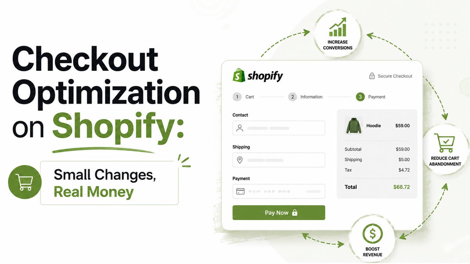
The checkout is the most expensive real estate in your entire store. Every visitor who reaches it has done the hard part — they want to buy. And then some of them don’t, because of friction that has nothing to do with whether they wanted the product. That’s the painful kind of lost sale: not “they weren’t interested,” but “they were interested and something got in the way.”
A bit of good news before we start: Shopify’s checkout is well-optimized out of the box. It’s fast, it’s trusted, it converts well, and Shopify pours real effort into improving it. So checkout optimization on Shopify is less about rebuilding the checkout and more about not sabotaging it, plus making smart use of what you can control. Let me go through where the money actually leaks.
Offer guest checkout (this is the big one)
If you make people create an account before they can buy, you are losing sales. Full stop. A shopper ready to hand you money does not want to first invent a password, verify an email, and fill out a profile. Forced account creation is one of the most reliable conversion killers there is, and it’s entirely self-inflicted.
Let people check out as guests. You can still invite them to create an account after the purchase, when the friction doesn’t cost you the sale — “save your details for next time” lands very differently once they’ve already bought. The instinct to force accounts usually comes from wanting customer data or repeat logins, but the trade isn’t worth it: you’re sacrificing first-purchase conversions for a database entry. Guest checkout first, account invitation second.
Be honest about costs early, not at the last step
I’ll keep banging this drum because it’s the number-one documented reason for cart abandonment: unexpected costs at checkout. The shopper has the total in their head, reaches the final step, sees shipping and fees they weren’t expecting, and the deal they’d mentally agreed to suddenly feels different. So they leave, often irritated.
The fix isn’t really a checkout fix — it’s showing costs earlier, on the product page and in the cart, so nothing at checkout is a surprise. If you offer free shipping over a threshold, make that loud and clear before checkout. The principle: the total a shopper sees at checkout should confirm what they already expected, not spring something new on them. Surprise is the enemy.
Lean on express payment options
Express checkout buttons — the wallet options that let returning shoppers pay in a tap without typing out card and address details — are one of the best things you can enable, especially for mobile. They collapse the entire form into a single authenticated action. For a shopper on their phone, the difference between typing a full address and card number versus tapping one button is the difference between buying and giving up.
Shopify supports these, and turning them on (and placing them prominently) removes an enormous amount of friction for a big chunk of shoppers. This is low-effort, high-return, and it disproportionately helps mobile conversion, which is where most stores have the most to gain.
Keep the form as short as it honestly needs to be
Every field in checkout is a small chance for someone to stall. Some fields are necessary — you need a shipping address. But a lot of stores ask for more than they need, or don’t take advantage of features that reduce typing, like address autocomplete. Cut the optional fields you don’t really use. Don’t ask for a phone number unless you actually need it. Let the system auto-fill and validate addresses where possible. Each bit of friction you remove is a few more people who make it through.
Trust signals at the moment of payment
There’s a specific flicker of doubt that hits some shoppers right as they’re about to enter payment details, especially if they’ve never bought from you before. Is this safe? Is this site legit? Will the thing actually show up? Reassurance right at that moment helps: visible security indicators, recognizable payment methods, a clear return policy within reach, accessible contact info that signals a real business stands behind the store.
Shopify’s checkout already carries trust by being recognizable and secure, which is part of why it converts. But for first-time buyers especially, those small reassurances at the payment step quietly tip hesitant people over the line. Trust is often the invisible thing standing between a full cart and a completed order.
What you can customize, and when it matters
On standard Shopify, your ability to customize the checkout itself is limited — which is fine, because the default is strong and you mostly don’t want to mess with it. On Shopify Plus, you get real checkout customization through Checkout Extensibility: custom fields, content, branding, post-purchase upsells, custom logic. That unlocks things like one-click post-purchase offers (great for AOV without touching the core conversion) and tailored B2B checkout flows.
But here’s the caution: just because you can customize the checkout on Plus doesn’t mean you should pile stuff into it. The checkout’s job is to get out of the way and let people pay. Add things that really help — a post-purchase upsell, a needed custom field, on-brand styling — and resist the urge to clutter the one place where simplicity converts best. More in the checkout is usually worse, not better.
Don’t forget speed and mobile here too
A slow or janky checkout, especially on mobile, loses people at the worst possible moment. Everything I’ve said about store speed applies doubly to the checkout and the steps leading into it. And since most shoppers are on phones, the mobile checkout experience isn’t a scaled-down afterthought — it’s the main event. Test your actual checkout on a real phone, on a normal connection, and fix anything that’s slow, fiddly, or awkward to tap. The smoothest desktop checkout in the world doesn’t help if the mobile one frustrates the majority of your buyers.
The bottom line
Checkout optimization on Shopify is mostly about removing friction, not adding cleverness. Offer guest checkout. Show costs early so nothing’s a surprise. Turn on express payment options. Keep the form lean. Reassure first-time buyers at the payment step. And on Plus, customize thoughtfully without cluttering the one place where simplicity wins. The checkout converts best when it’s fast, trustworthy, and effortless — your job is to protect that, not complicate it. Small reductions in friction here translate, directly and measurably, into real money, because you’re rescuing the sales you’d already earned.
Reduce the surprises, not just the fields
Beyond the mechanics of guest checkout and short forms, the deeper principle of checkout optimization is that people abandon at surprises and friction, so the highest-leverage work is removing both — and surprises, especially about cost, are the bigger culprit. Understanding this reframes checkout optimization from “tweak the form” to “eliminate the reasons people balk.”
The leading cause of genuine checkout abandonment, survey after survey, is unexpected costs appearing at the last step — shipping, taxes, or fees that change the math the shopper did in their head. Someone mentally committed to a $40 purchase, sees it become $52 at checkout, and the deal they’d agreed to with themselves suddenly feels different, so they leave, often more annoyed than if you’d told them upfront. The fix isn’t in the checkout at all — it’s earlier. Show shipping costs, or the threshold for free shipping, on the product page and in the cart, so the number the shopper carries into checkout is the real one. A free-shipping progress bar (“you’re $12 away”) both removes the surprise and nudges order value up. The principle is that the first cost a shopper sees anchors their expectation, and any increase from there feels like a penalty, so front-load the real number and you trade a few early balkers (who’d have balked at checkout anyway) for many more who proceed without the nasty reveal.
The same “remove surprises” logic applies to everything about the checkout. Uncertainty about delivery time makes people hesitate, so state it clearly. Doubt about whether they can return something freezes hesitant buyers, so surface the return policy where it reassures. Worry about whether the site is safe stops people at the payment step, so put security and trusted payment signals right where the card details go. Each of these is a doubt that, left unanswered at the moment of payment, quietly costs you the sale — and each is cheap to address by simply putting the reassuring information where the doubt strikes.
So think of checkout optimization as two complementary jobs: remove friction (guest checkout, short forms, express payments, speed) and remove surprises (honest costs shown early, clear delivery and return information, trust signals at the point of payment). The friction work makes buying easy; the surprise work makes buying feel safe. Most stores focus on the form fields and neglect the surprises, but the surprises — especially cost surprises — are usually the bigger leak. Handle both, and you stop losing the shoppers who wanted to buy and were lost to something that had nothing to do with the product.
Test, measure, and don’t over-engineer
Because Shopify’s checkout is already well-optimized, the risk isn’t under-building it — it’s either sabotaging it or over-complicating it, so the discipline is to make deliberate, measured improvements rather than reflexive changes. Knowing what to measure and what to leave alone keeps you from turning a strong default checkout into a worse one.
Start with what to measure, because “checkout optimization” only means something if you can see whether a change helped. The metric that matters most is checkout completion rate — of the people who start checkout, how many finish. That’s the number your changes should move. Watch it alongside overall conversion and revenue, not in isolation, because a change that looks good on one metric can hurt another: an aggressive upsell in the checkout flow might lift average order value while dropping completion, which is a loss disguised as a win. Tie every change back to completed orders and revenue, and you’ll keep the improvements that actually help and reverse the ones that merely looked clever.
Then respect what’s already working. Shopify pours enormous effort into its checkout — it’s fast, trusted, and converts well — so the goal on standard Shopify is mostly to not sabotage it (don’t force accounts, don’t spring costs, don’t add friction) and to make smart use of what you can control, rather than to rebuild it. On Shopify Plus you can customize the checkout more (through Checkout Extensibility — custom fields, content, upsells, branding, logic), and that’s useful for specific needs, but the same discipline applies: each customization should earn its place by helping conversion or serving a real requirement, not complicating a checkout that was already good. More customization is not automatically better; a clean, fast, trustworthy checkout beats a cluttered, clever one.
The practical rhythm is to make one meaningful change at a time — offer guest checkout, surface costs earlier, add express payments, tighten a form field — and measure its effect on completion and revenue before moving on. Changing many things at once means you can’t tell what worked, and reflexively piling on customizations risks degrading the strong default. Higher-traffic stores can run proper tests; lower-traffic ones are better off applying sound principles and watching the completion rate over a fair window. Either way, the winning approach to Shopify checkout optimization is deliberate and measured: remove the known friction and surprises, use Plus customization judiciously where it serves a real need, measure completion and revenue rather than vanity metrics, and resist the urge to over-engineer a checkout that Shopify has already made very good.
A practical order of operations for checkout
Pulling the pieces together, it helps to have a concrete sequence for improving your checkout, because the improvements have a natural priority and doing the highest-leverage ones first gets you most of the gain quickly. Here’s the order that tends to deliver the most recovered revenue for the least effort on a Shopify store.
First, offer guest checkout if you haven’t. Forced account creation is one of the most reliable conversion killers there is, and it’s entirely self-inflicted, so making account creation optional (and inviting it after purchase instead) is usually the single highest-return checkout change available. Start here, because nothing else matters as much if you’re making ready-to-buy shoppers invent a password first.
Second, fix cost surprises. Surface shipping costs, or the free-shipping threshold, on the product page and in the cart so the number the shopper carries into checkout is the real one. Since unexpected costs at checkout are the leading cause of genuine abandonment, front-loading the real cost recovers a meaningful slice of shoppers who’d otherwise balk at the last step — and a free-shipping progress bar does double duty by nudging order value up.
Third, add express payment options — the wallet buttons that let returning shoppers pay in a tap without typing card and address details. These collapse the whole form into a single action for a large share of shoppers and are a straightforward, high-value addition.
Fourth, tighten the form and remove friction: drop or auto-fill every field you can, so there’s less effort between “I want this” and “it’s mine.” Fifth, reinforce trust at the point of payment — security indicators, recognizable payment methods, a visible return policy — to answer the doubts that freeze hesitant, especially first-time, buyers. Sixth, confirm speed and mobile, because a slow or clunky checkout on a phone loses people regardless of everything else, and most of your traffic is on phones.
Only after these fundamentals should you reach for Plus-level customization (through Checkout Extensibility), and then judiciously — custom fields, content, upsells, or logic that serve a real need and earn their place, rather than complicating a checkout that’s already strong. Throughout, make one change at a time and measure its effect on checkout completion and revenue, so you keep what helps and reverse what doesn’t. This sequence — guest checkout, honest costs, express payments, less friction, trust signals, speed and mobile, then judicious customization — front-loads the changes with the biggest, most reliable payoff, so you recover the most revenue soonest and refine from there rather than fiddling with minor tweaks while a self-inflicted conversion killer sits unaddressed.
Frequently asked questions
Isn’t Shopify’s checkout already optimized — what’s left for me to do?
Shopify’s checkout is strong out of the box — fast, trusted, and high-converting — so your job is mostly to not sabotage it and to make smart use of what you control, rather than to rebuild it. The self-inflicted leaks are the big ones: forcing account creation, springing shipping costs at the last step, adding needless form friction, or a slow, clunky mobile checkout. Fix those, add express payments, reinforce trust at the point of payment, and you capture most of the available gain. On Shopify Plus you can customize the checkout further through Checkout Extensibility, but do so judiciously — each customization should earn its place by helping conversion or serving a real need, not complicate a checkout that’s already very good.
What checkout change should I make first?
Offer guest checkout if you don’t already — forced account creation is one of the most reliable conversion killers, and it’s entirely self-inflicted, so making accounts optional (and inviting them after purchase) is usually the highest-return checkout change. After that, work in order of leverage: surface shipping costs early so there’s no last-step surprise, add express wallet payments, tighten and auto-fill the form, reinforce trust at the point of payment, and confirm speed and mobile. Only then reach for Plus-level customization, and judiciously. Make one change at a time and measure its effect on checkout completion, so you keep what helps.
What metric should I watch for checkout optimization?
Checkout completion rate — of the people who start checkout, how many finish — is the number your changes should move. Watch it alongside overall conversion and revenue rather than in isolation, because a change can help one metric and hurt another: an aggressive in-checkout upsell might raise average order value while dropping completion, which is a loss disguised as a win. Tie every change back to completed orders and revenue, make one meaningful change at a time so you can tell what worked, and keep the improvements that lift the total rather than just a single metric.
Should I require customers to create an account to check out?
No. Forced account creation is one of the most reliable conversion killers there is. Offer guest checkout, and invite customers to create an account after purchase, when the friction no longer costs you the sale. You get the conversion now and can still capture the relationship afterward.
Why do people abandon at checkout even after adding to cart?
The leading documented reason is unexpected costs — shipping, taxes, or fees that appear at the final step and change the total the shopper had in mind. Show those costs earlier (product page and cart) so checkout confirms expectations rather than springing a surprise. Friction, trust doubts, and slow mobile checkout are other common causes.
Are express payment buttons worth enabling?
Yes, especially for mobile. They let returning shoppers pay in a single authenticated tap instead of typing out card and address details, removing a huge amount of friction exactly where mobile shoppers tend to give up. It’s low-effort and high-return.
Can I customize the Shopify checkout?
On standard Shopify, only lightly — which is fine, since the default converts well. On Shopify Plus you get real customization through Checkout Extensibility (custom fields, branding, post-purchase upsells, custom logic). Use it thoughtfully; the checkout converts best when it stays simple, so add only what really helps.